

Introduction text – All pages should have a sentence or 2 of ‘intro-text’. On this site – add the class intro-text to the text editor rather than using block quote for styling. If you want an additional paragraph in body text, add a second text box.
Unless Content is ‘FULL WIDTH’ top level containers must use the CSS Class page-margin, page-margin-0-top, or page-margin-0-top-btm.
This allows base containers to have full width background, with page margin padding. It is set in the Custom CSS.
2 column Full width text, should have the page-margin class added to the 2 x inner containers.
Slider widget
The padding below the left column description should be removed if there is no CTA button in the left column content.
Image height is set through a class sc-slide-3-2 added to the widget.
Lorem ipsum dolor sit amet, consectetur adipiscing elit. Ut elit tellus, luctus nec ullamcorper mattis, pulvinar dapibus leo.
Image height is set through a class 'sc-slide-3-2' added to the widget.
Delete 'Content' and 'Style Override' Or this whole item, unless text over top is needed.
Nav block
The class 'sc-navblock-3-2' has been added to this nav block. It will scale images proportionatly at a ratio of 3:2. Dont worry about image quality.
Accordion
Heading 4 āēīōū ĀĒĪŌŪ
Lorem ipsum dolor sit amet, consectetur adipiscing elit. Ut elit tellus, luctus nec ullamcorper mattis, pulvinar dapibus leo.
Heading 5 āēīōū ĀĒĪŌŪ
Lorem ipsum dolor sit amet, consectetur adipiscing elit.
Lorem ipsum dolor sit amet, consectetur adipiscing elit. Ut elit tellus, luctus nec ullamcorper mattis, pulvinar dapibus leo.
Heading 6 āēīōū ĀĒĪŌŪ – Same as body with reduced bottom margin
- Lorem ipsum dolor sit amet, consectetur adipiscing elit. Ut elit tellus, luctus nec ullamcorper mattis, pulvinar dapibus leoLorem ipsum dolor sit amet, consectetur adipiscing elit. Ut elit tellus, luctus nec ullamcorper mattis, pulvinar dapibus leo.
- Lorem ipsum dolor sit amet, consectetur adipiscing elit. Ut elit tellus, luctus nec ullamcorper mattis, pulvinar dapibus leo. Consectetur adipiscing elit. Ut elit tellus, luctus nec ullamcorper mattis, pulvinar dapibus leo.
Heading 6 āēīōū ĀĒĪŌŪ
Far far away, behind the word mountains, far from the countries Vokalia and Consonantia, there live the blind texts. Separated they live in Bookmarksgrove right at the coast
Far far away, behind the word mountains, far from the countries Vokalia and Consonantia, there live the blind texts. Separated they live in Bookmarksgrove right at the coast
Accordion for complext or dynamic content
Heading 4 āēīōū ĀĒĪŌŪ
Lorem ipsum dolor sit amet, consectetur adipiscing elit. Ut elit tellus, luctus nec ullamcorper mattis, pulvinar dapibus leo.
Heading 5 āēīōū ĀĒĪŌŪ
Lorem ipsum dolor sit amet, consectetur adipiscing elit.
Lorem ipsum dolor sit amet, consectetur adipiscing elit. Ut elit tellus, luctus nec ullamcorper mattis, pulvinar dapibus leo.
Heading 6 āēīōū ĀĒĪŌŪ – Same as body with reduced bottom margin
- Lorem ipsum dolor sit amet, consectetur adipiscing elit. Ut elit tellus, luctus nec ullamcorper mattis, pulvinar dapibus leoLorem ipsum dolor sit amet, consectetur adipiscing elit. Ut elit tellus, luctus nec ullamcorper mattis, pulvinar dapibus leo.
- Lorem ipsum dolor sit amet, consectetur adipiscing elit. Ut elit tellus, luctus nec ullamcorper mattis, pulvinar dapibus leo. Consectetur adipiscing elit. Ut elit tellus, luctus nec ullamcorper mattis, pulvinar dapibus leo.
Heading 6 āēīōū ĀĒĪŌŪ
Item #2
Item #3
Boxed Image & Text Container
When an image is next to text within the page margins. A basic container setup seems to be working better than the Image Cointent (SC) widget.
If the Lead in text is used, apply a negative margin var(–sc-margin-half-neg) to the lead in text heading box.
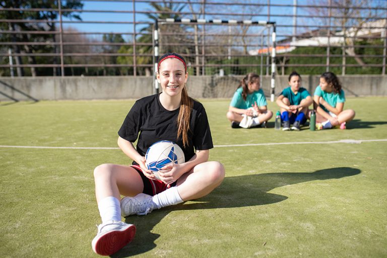
Boxed Image & Text Container
When an image is next to text within the page margins. A basic container setup seems to be working better than the Image Cointent (SC) widget.
If the Lead in text is used, apply a negative margin var(–sc-margin-half-neg) to the lead in text heading box.
Apply the class dark-bg to the container.
This is the Content BOX
It has the class dark-bg applied to the widget.
Image Content (SC)
The parent container must NOT have the page margin class applied for this widget to appear full width.
Delete the 'Button Text' in the content tab to remove the button
Image Content (SC)
The parent container must NOT have the page margin class applied for this widget to appear full width.
Delete the 'Button Text' in the content tab to remove the button
Image Content (SC)
The parent container must NOT have the page margin class applied for this widget to appear full width.
Delete the 'Button Text' in the content tab to remove the button
Image Content (SC)
Apply the class dark-bg to the the widget to change the text, button and link colours.
The parent container must NOT have the page margin class applied for this widget to appear full width.
Delete the 'Button Text' in the content tab to remove the button
2 Column Content
Apply the class page-margin to the 2 x inner containers NOT the outer parent container
Current Board Members
- Colin May
- James West
- Ryan Brenchley
- Matt Abraham
- Christine Mackay
- Tom Osborne
- Thomas Nehemia
- Leigh Harland
- Jane Coup – Principal
- Fleur Walter – Staff Representative
- Thea Tumamac – Student Representative*
Find out more about our curriculum structure, learning areas, and the ways we support our learners.
Explore our range of sporting opportunities.
Discover opportunities in music, drama, kapa haka, and more.
Learn more about how we support our students and help them thrive.
Blockquote – On this site, the blockquote is styled smaller than intro, so it can be used elsewhere for emphasis, or quotes.
Heading 1 āēīōū ĀĒĪŌŪ
Heading 2 āēīōū ĀĒĪŌŪ
Lorem ipsum dolor sit amet, consectetur adipiscing elit.
Lorem ipsum dolor sit amet, consectetur adipiscing elit. Ut elit tellus, luctus nec ullamcorper mattis, pulvinar dapibus leo. āēīōū ĀĒĪŌŪ
Lorem ipsum dolor sit amet, consectetur adipiscing elit. Ut elit tellus, luctus nec ullamcorper mattis, pulvinar dapibus leoLorem ipsum dolor sit amet, consectetur adipiscing elit. Ut elit tellus, luctus nec ullamcorper mattis, pulvinar dapibus leo.
Heading 3 āēīōū ĀĒĪŌŪ
Lorem ipsum dolor sit amet, consectetur adipiscing elit.
Lorem ipsum dolor sit amet, consectetur adipiscing elit. Ut elit tellus, luctus nec ullamcorper mattis, pulvinar dapibus leo.
Heading 4 āēīōū ĀĒĪŌŪ
Lorem ipsum dolor sit amet, consectetur adipiscing elit.
Lorem ipsum dolor sit amet, consectetur adipiscing elit. Ut elit tellus, luctus nec ullamcorper mattis, pulvinar dapibus leo.
Heading 5 āēīōū ĀĒĪŌŪ
Lorem ipsum dolor sit amet, consectetur adipiscing elit.
Lorem ipsum dolor sit amet, consectetur adipiscing elit. Ut elit tellus, luctus nec ullamcorper mattis, pulvinar dapibus leo.
Heading 6 āēīōū ĀĒĪŌŪ – Same as body with reduced bottom margin. Use it for the sentense before bullets:
- Lorem ipsum dolor sit amet, consectetur adipiscing elit. Ut elit tellus, luctus nec ullamcorper mattis, pulvinar dapibus leoLorem ipsum dolor sit amet, consectetur adipiscing elit. Ut elit tellus, luctus nec ullamcorper mattis, pulvinar dapibus leo.
- Lorem ipsum dolor sit amet, consectetur adipiscing elit. Ut elit tellus, luctus nec ullamcorper leo. Lorem ipsum dolor sit amet, consectetur adipiscing elit. Ut elit tellus, luctus nec ullamcorper mattis, pulvinar dapibus leo.
- Lorem ipsum dolor sit amet, consectetur adipiscing elit. Ut elit tellus, luctus nec ullamcorper mattis, pulvinar dapibus leo. Consectetur adipiscing elit. Ut elit tellus, luctus nec ullamcorper mattis, pulvinar dapibus leo.